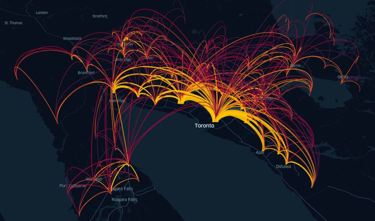
Visualizing data helps us better understand how we move

Awesome to see my friend Anthony’s work profiled.

Metrolinx News

The idea of number-crunching and analyzing data may seem boring to some. For others though, processing information and turning it into something more is a passion.

Anthony Smith loves visualizing transit and transportation data with maps and animations. By doing so, he hopes his work can make a difference by providing an evidence-based approach to city planning.

“I think data gives a voice to everyone,” said Smith. “As an urban planner, I believe that using the data to inform how cities grow ensures efficient use of available resources for maximum public benefit.”

Anthony has been conducting data science and producing maps and infographics for more than ten years. While he does work at Metrolinx, he also spends a great deal of time creating images in his own time.

“It’s always exciting to discover a new dataset or visualization tool that I can use to create something,” said Smith. “Just last…

View original post 80 more words

Leave a Reply

Fill in your details below or click an icon to log in:

WordPress.com Logo

You are commenting using your WordPress.com account. Log Out /  Change )

Twitter picture

You are commenting using your Twitter account. Log Out /  Change )

Facebook photo

You are commenting using your Facebook account. Log Out /  Change )

Connecting to %s

%d bloggers like this: